S. Anselm’s School
S. Anselm’s is the only prep school in the Peak District, with over 130 years of history and a setting that’s as distinctive as the education it offers. When a group of local parents saved the school from closure and brought it back to life, they needed a digital and brand presence worthy of that remarkable story.
Key Deliverables
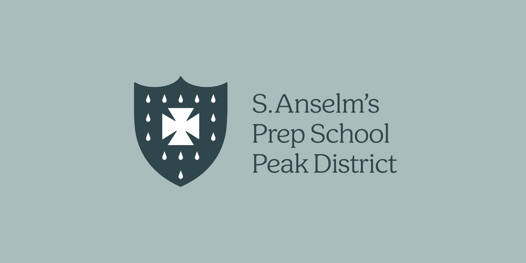
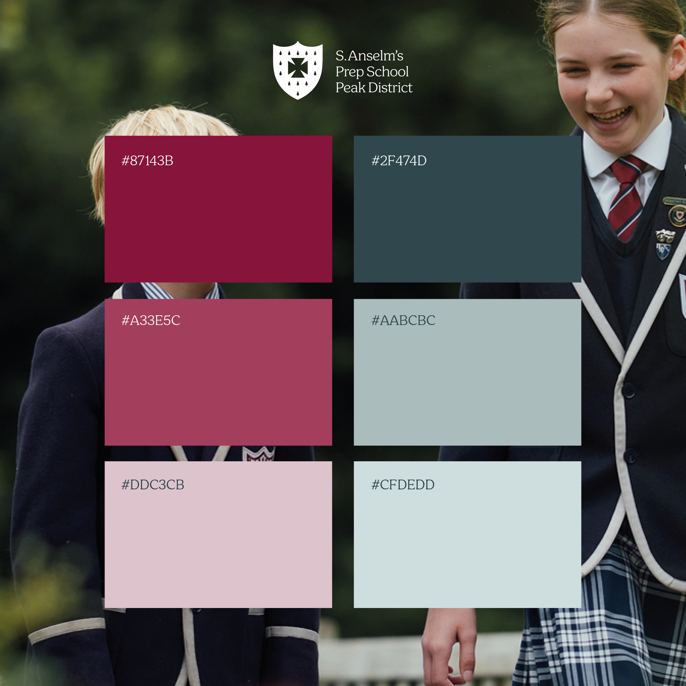
Brand development | Responsive website l School logo refresh | Nursery logo design | Colour palette, typography + imagery style | Illustration
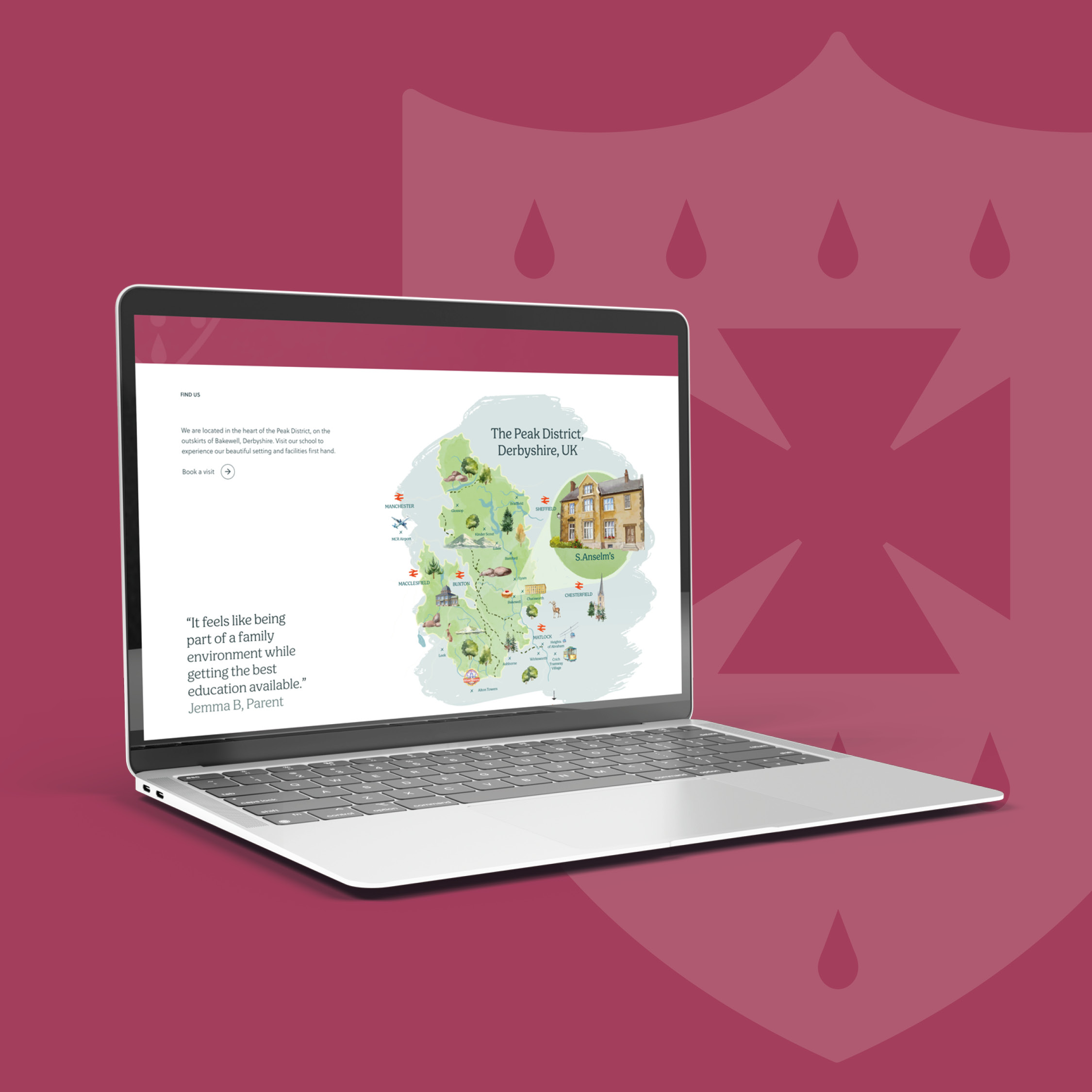
The school had no website, no real brand, and an urgent need to promote a critical open day which was just weeks away. The brief was clear: get a site live quickly, and make sure it did justice to everything that makes S. Anselm’s special.
We worked closely with the school to develop a fresh visual identity through both the design of the website and the brand, developing a new colour palette, typographic style and visual direction to reflect that of the school’s warmth, ambition and natural Peak District setting. The result is a brand and website that feels rooted in heritage, and ready for the future.
“S. Anselm’s is a truly special school with a story that deserves to be told well. It was a pleasure to help bring that story to life through a new website and visual identity. We are proud to have played a role in their remarkable comeback.”
Chris Vannozzi, Account Director, CRUSH

“The team at CRUSH were fantastic to work with throughout our project. Despite our (very) short time-frames they took the time to understand our school, both as it currently stands and the future vision. This care resulted in a clean, modern website that’s easy for our families to use and for our team to manage. The whole process was smooth, collaborative and delivered exactly what we needed. In CRUSH we found a true partner, not just an agency delivering a tick list.”
Katherine Pinner, Trustee, S. Anselm’s School