Fonetti
¼ of children in England currently leave primary school without reaching the expected standard of reading. Fonetti has been created to change that. But with no clear messaging or memorable identity, the brand was struggling to cut-through to the audiences who matter most.
Key Deliverables
Brand strategy | Messaging hierarchy | Brand development | Character design | Animation | Responsive website | Comprehensive brand guidelines | Sales collateral | Social media templates
Developed by education technology specialists from the University of Edinburgh, Fonetti is a one–of-a-kind reading aloud platform that’s been created specifically to help children practice reading out loud and become more confident readers.
At a time where 1.9 million children in the UK are behind with their talking and/or understanding of words – the highest number ever recorded – Fonetti’s mission is to support children to discover reading for meaning and pleasure through 1:1 support and independent learning.
But despite the countless USPs that Fonetti brings to the table, the team was struggling to communicate with the teachers, SENDCos, and parents who could benefit from the platform most. What the brand, visual identity and messaging all lacked was the clarity and confidence that Fonetti deserved as a leading product in the EdTech industry and a business backed by the likes of Clare Balding and GoHenry Founder Louise Hill.
From day one, the CRUSH team knew that this project required a complete rethink of what Fonetti is; Who is it for? What does it do? How does it actually work? We started by stripping everything back to basics; diving into the fundamentals of the science behind the technology, evaluating similar products and the market context, and regularly discussing how Fonetti is both within the internal team, and by the customers already using it.


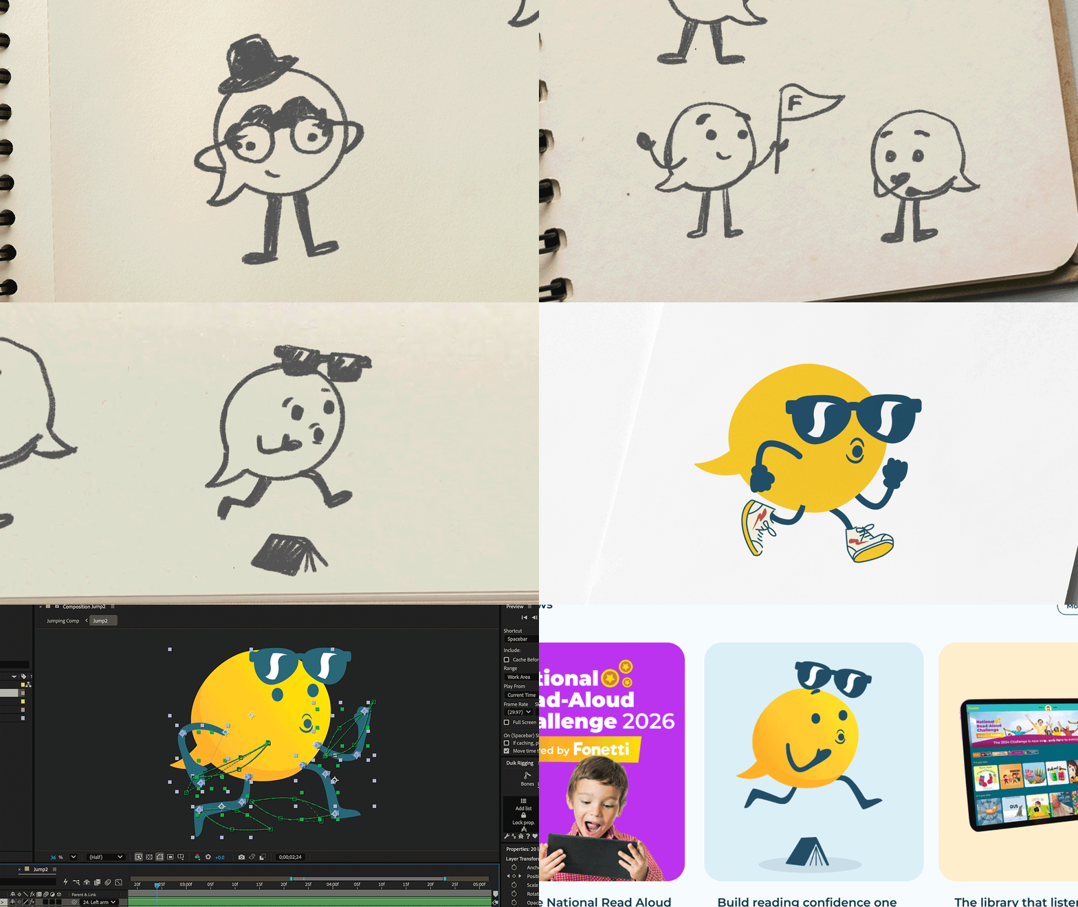
From this research was born the idea of Fonetti as the ‘Personal Reading Coach’, positioning the platform as a fitness tracker for reading. By listening, correcting mistakes and tracking reading progress in real-time, Fonetti is the coach, companion and motivator every child needs to make big strides in their reading journey.
We further brought this idea to life through the development of the Fonetti speech-bubble-shaped character, playfully animated through a suite for motion graphics and static forms. The breadth of this leant well into the flex of Fonetti as a platform aimed at teachers, teaching assistants, SENDCos, English Leads, parents, guardians, children, and even adults learning English as an Additional Language.

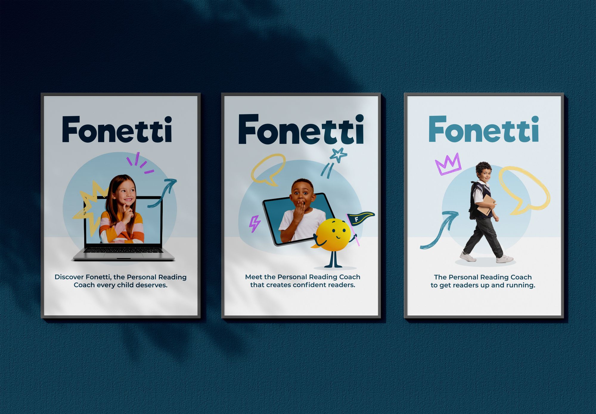
Next came working everything from the strategy, character and logo into a cohesive brand system. We chose not to change the fonts or logo, but simply refresh the colours and develop a palette that marries together soft pastels with bright tones to create a crisper, more lively colour palette. We also introduced more visual elements at this stage, including the collage imagery with illustrative graphics for an extra pop.
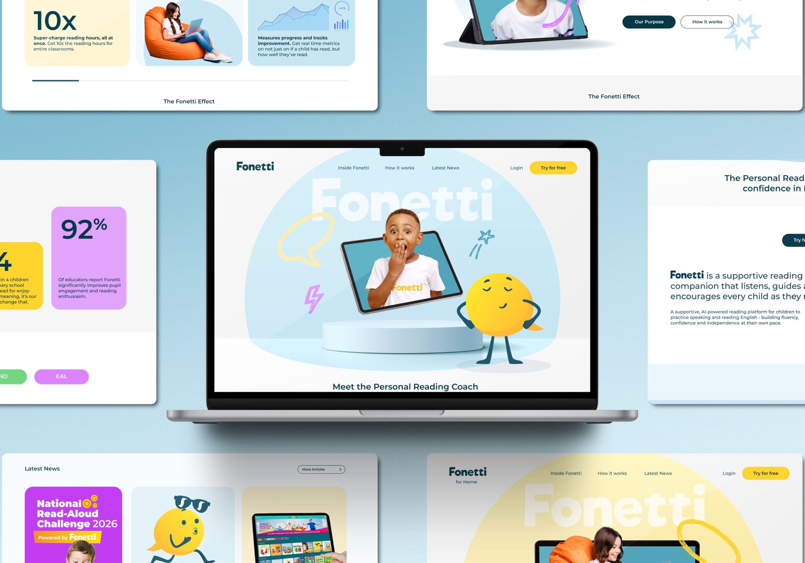
Finally – the rollout. Now that we had established Fonetti’s core messaging, positioning and visual identity, we needed to activate the new brand across the most important customer touchpoint of all; the website.
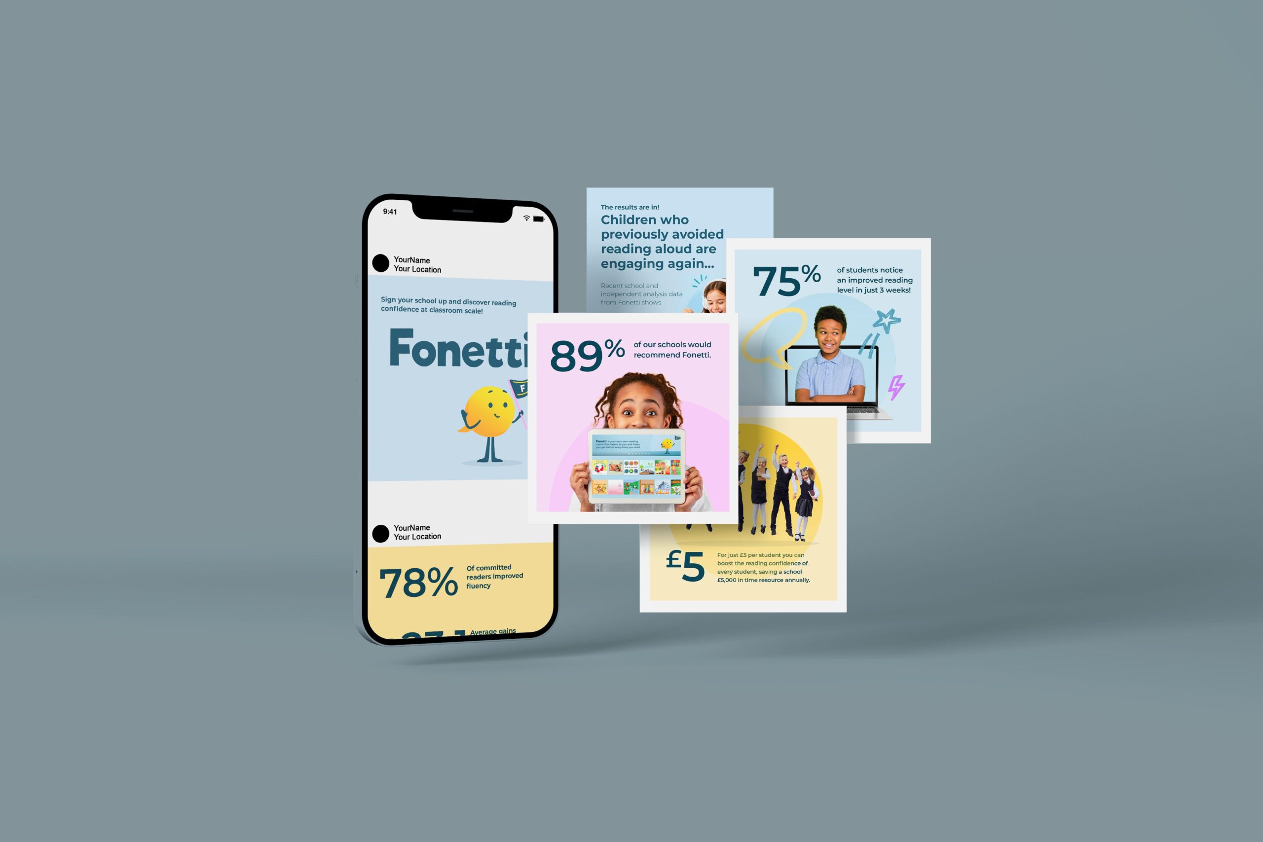
Carefully designed, written and built to target Fonetti’s two most critical audiences (school and home users), we wanted the website to be clean, considered and easy to navigate towards sign-ups and trials. This approach was continued as we then moved on to developing social media templates, sales collateral and marketing materials.