Pantone’s Colour of the Year is eagerly awaited by those of us in the design industry. Pantone make the announcement based on the trends they see coming through the industry – whether it be fashion, creative, home, event planning or corporate. Likewise, the announcement will be the cue for a swathe of emerald-coloured products to burst into the marketplace.
Twice a year Pantone hosts a secret meeting of representatives from various nations’ colour standards groups. After two days of debate, they choose a colour…it’s as big a secret as choosing a pope!
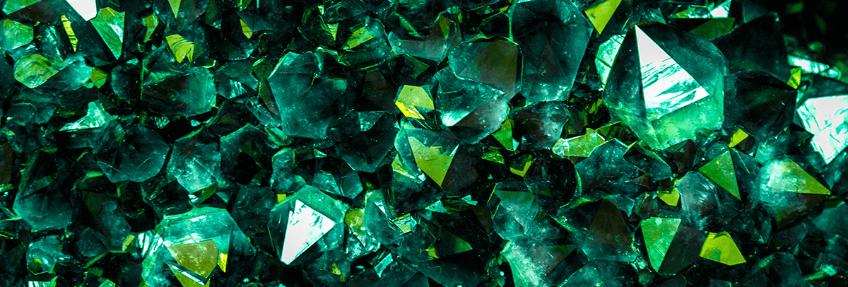
So why Emerald? Leatrice Eiseman, executive director of the Pantone Colour Institute says: “The most abundant hue in nature, the human eye sees more green than any other colour in the spectrum. Symbolically, Emerald brings a sense of clarity, renewal and rejuvenation, which is so important in today’s complex world. This powerful and universally-appealing tone translates easily to both fashion and home interiors.”
She continues: “The prevalence of green has been steadily rising for several seasons now, especially in the fashion and couture markets, and even on the red carpet.”
We agree; it’s vivid, stunning, stylish and cheery. The classic jewel tones are always popular and this has the potential to really make its mark in the design world in all types of ways. We look forward to seeing a lot more about.
Instagram joined the 2013 Pantone Colour of the Year celebration on their blog today: http://bit.ly/TF7Jhr! They’ve chosen some spectacular emerald photos and invite you to share your own using the #coloroftheyear hashtag.
Diamonds may be forever, but it’s emerald for 2013…