Pantone’s colour of the year: Why does it matter?
Pantone has announced their infamous Colour of the Year for 2024, and, as a creative marketing agency, we are very keen to share our thoughts.
But firstly, you may be wondering what Pantone actually is, and why does its selected colour of the year matter to so many in the design industry?
In this blog, we’ll be putting Pantone under the microscope, discussing why it’s so revered and sharing our thoughts on this year’s chosen colour. We’ll also be sharing our teams’ selected colours of the year, to see if we can do any better than the Pantone team…
About Pantone
Whether you work in design, marketing, manufacturing, beauty, architecture or are simply in the process of painting your home, you’ll no doubt have come across Pantone before.
Essentially, it’s a company that provides a universal language for identifying, matching and mixing colours. It may sound basic, but as a tool that is used worldwide across countless different industries, its expertise is definitely not to be overlooked.
What is Pantone’s ‘Colour of the Year’?
Pantone’s journey began back in the 60s and has since become a worldwide phenomenon that has truly revolutionised the printing industry. On its road to success, it then established its Colour of the Year through a 1999 training programme. The initiative was in the aim of “drawing attention to the relationship between culture and colour”, and portraying how global culture is reflected in colour.
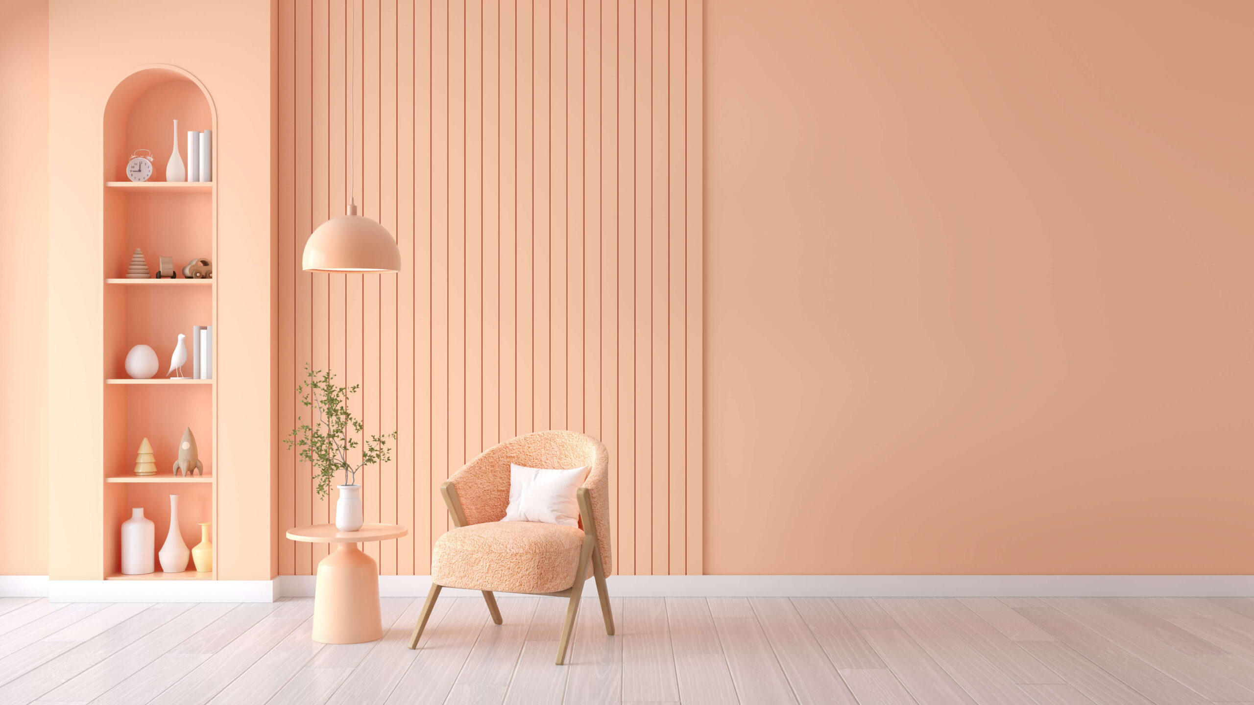
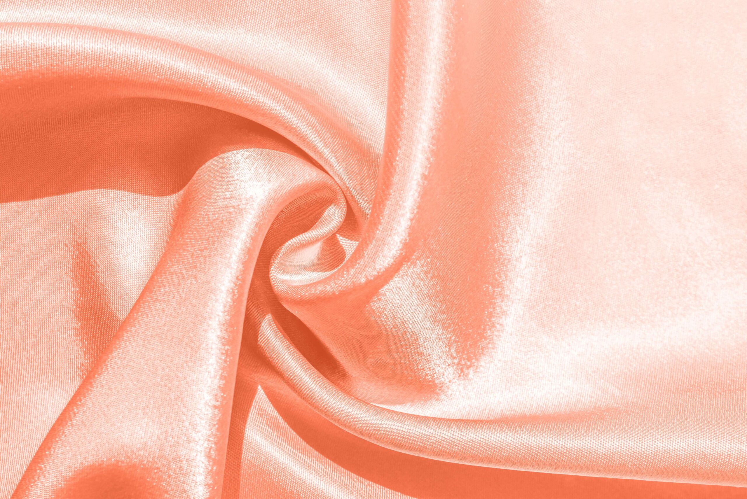
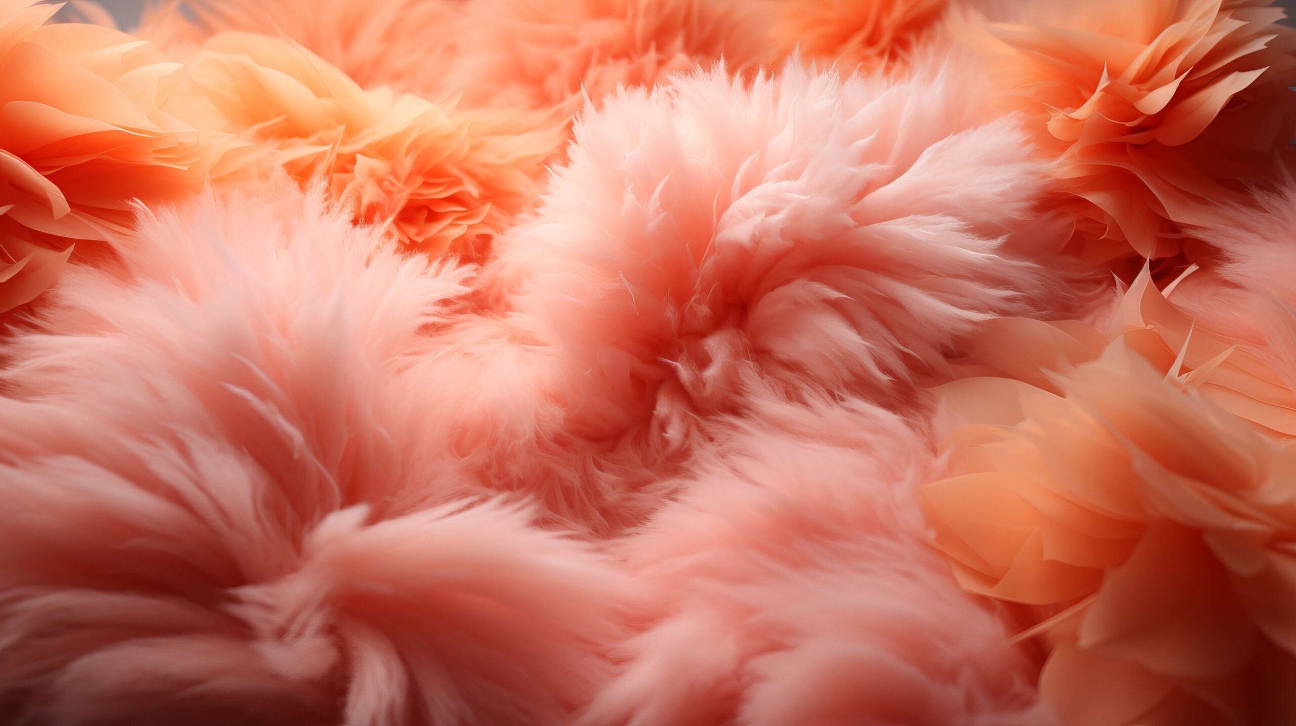
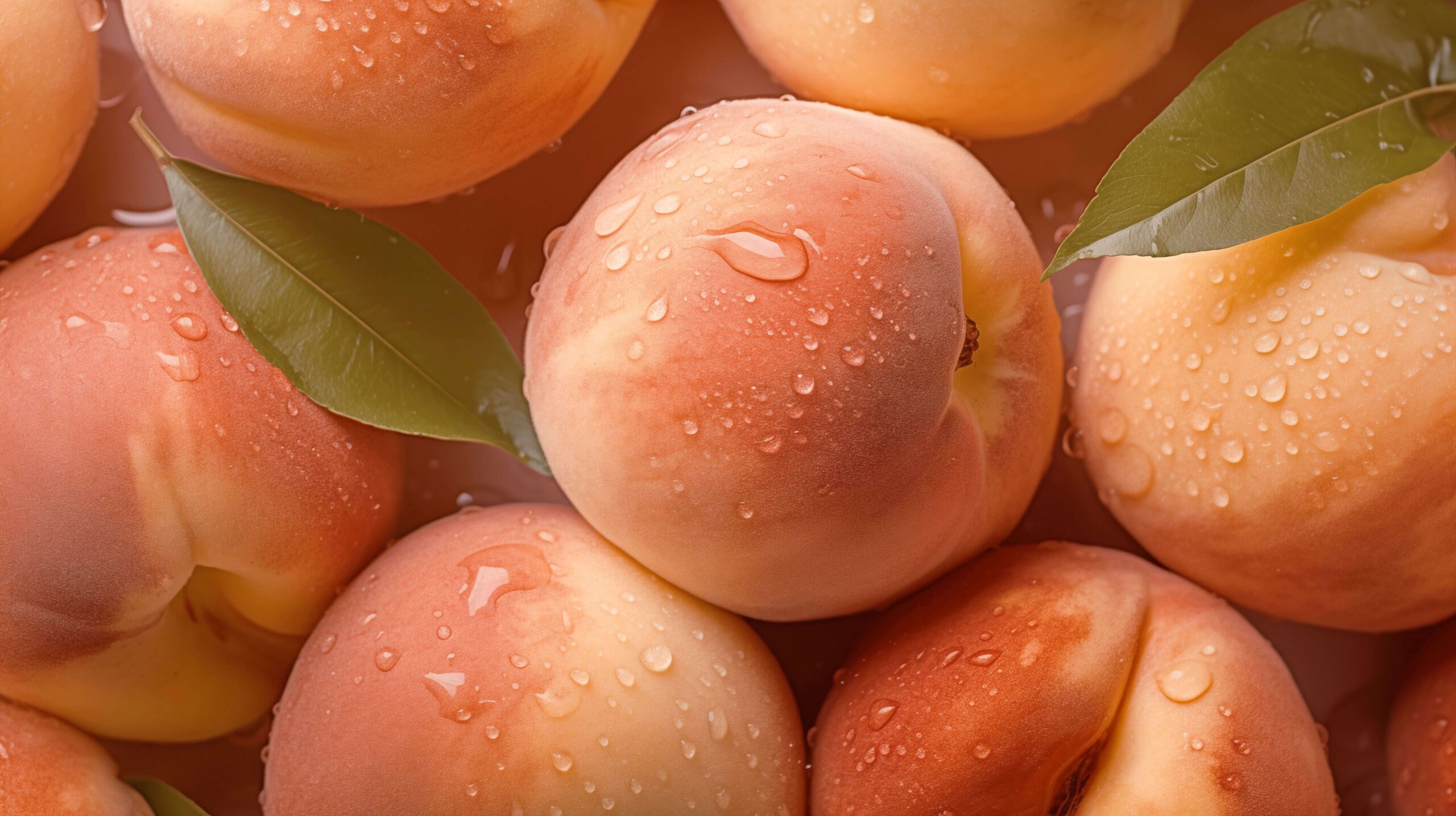
For example, this year’s colour is ‘Peach Fuzz’, and is said to “echo our innate yearning for closeness and connection”. Arriving at a “dark time amid a tumultuous war and a tense election year”, the 2024 colour symbolises the world’s need for calmness and peace.
However, aside from making a comment on societal and political culture, it’s also a concept that sets trends across the branding, marketing and creative sector. This leads to brand awareness opportunities for not just Pantone but brands like Motorola, which features in promotions of 2024’s colour.
The colour also impacts the fashion industry, with celebrities, influencers and models incorporating the colour into their closets. Ironically, this is also something that is taken into consideration when Pantone comes to choosing the colour of the year. At a time when 80s and 90s fashion has been creeping back into the latest trends, this year’s pastel colour nods to our collective nostalgia for simplicity and subtle boldness, in contrast to the minimalist fashion we have previously adopted.
Our take
Overall, we can see why Pantone have chosen this year’s Peach Fuzz colour. Despite at first being slightly perplexed and perhaps underwhelmed (especially following last year’s strikingly rich Viva Magenta colour) we can see why it was chosen. Its quiet peacefulness invites us all to take a step back from the craziness that was 2023, and take a breath a fresh air – which is admittedly much needed for the team here at CRUSH!
However, we did want to take a crack at choosing our own colours, to portray the personalities and desires of each of our team members. From designers, web developers, writers and marketers, perhaps our differing choices reflect the brilliant variety that our incredible industry has to offer…