'%3E%3Cpath d='M74.213 49.4693L73.3419 49.5463L71.8001 54.7709H69.763L68.3721 50.1373L66.9567 54.7709H64.9336L63.4023 49.5463L62.5312 49.4693V48.3223H66.1454V49.4693L65.3235 49.5463L66.321 53.1343L67.7996 48.3258H69.633L71.0871 53.1343L72.1232 49.5463L71.2873 49.4693V48.3223H74.206V49.4693H74.213Z' fill='%239B7D3C'/%3E%3Cpath d='M78.7468 54.7653H74.9922V53.6182L75.9405 53.5413V49.5371L74.9922 49.4602V48.3131H77.7985V53.5378L78.7468 53.6147V54.7653ZM76.8642 47.4388C76.0564 47.4388 75.7895 47.0996 75.7895 46.4946C75.7895 45.8896 76.0915 45.5889 76.8783 45.5889C77.665 45.5889 77.953 45.9176 77.953 46.4946C77.953 47.0716 77.6755 47.4388 76.8642 47.4388Z' fill='%239B7D3C'/%3E%3Cpath d='M87.3772 54.7635H84.5709V51.4657C84.5709 49.7522 84.3426 49.364 83.3838 49.364C83.0185 49.364 82.6111 49.4514 82.3336 49.5283V53.543L83.2574 53.62V54.767H79.5273V53.62L80.4757 53.543V48.5841C81.1465 48.3813 82.295 48.168 83.4962 48.168C86.039 48.168 86.4289 48.9373 86.4289 51.4657V53.543L87.3772 53.62V54.767V54.7635Z' fill='%239B7D3C'/%3E%3Cpath d='M96.0296 54.7635H93.2233V51.4657C93.2233 49.7522 92.995 49.364 92.0361 49.364C91.6709 49.364 91.2634 49.4514 90.986 49.5283V53.543L91.9097 53.62V54.767H88.1797V53.62L89.128 53.543V48.5841C89.7988 48.3813 90.9473 48.168 92.1485 48.168C94.6914 48.168 95.0813 48.9373 95.0813 51.4657V53.543L96.0296 53.62V54.767V54.7635Z' fill='%239B7D3C'/%3E%3Cpath d='M102.753 51.9482H98.6194C98.6194 52.9414 98.8863 53.7737 100.34 53.7737C101.124 53.7737 102.061 53.6093 102.276 53.5464L102.353 54.592C101.949 54.7319 101.011 54.9207 99.5958 54.9207C97.4322 54.9207 96.8281 53.7247 96.8281 51.4726C96.8281 49.3568 97.7132 48.1748 99.8873 48.1748C102.061 48.1748 102.781 49.3568 102.781 51.4726C102.781 51.5355 102.767 51.8887 102.757 51.9517L102.753 51.9482ZM101.071 50.927C101.057 50.0702 100.93 49.2414 99.8451 49.2414C98.7599 49.2414 98.6299 50.0982 98.6299 50.927H101.071Z' fill='%239B7D3C'/%3E%3Cpath d='M108.209 49.4303C108.069 49.4058 107.679 49.3813 107.338 49.3813C106.871 49.3813 106.428 49.4932 106.263 49.5457V53.5499L107.289 53.6268V54.7738H103.457V53.6268L104.405 53.5499V48.591C104.887 48.4161 105.972 48.1748 107.036 48.1748C107.644 48.1748 108.135 48.2238 108.286 48.2517L108.209 49.4338V49.4303Z' fill='%239B7D3C'/%3E%3Cpath d='M66.5775 18.2099C66.5775 19.7906 65.1796 20.3081 63.7712 20.3081C62.3628 20.3081 61.2073 20.1053 60.8526 20.0179L60.9298 18.9198C61.2846 18.9967 62.3137 19.1611 63.1004 19.1611C64.14 19.1611 64.7371 18.8464 64.7231 17.8707V17.2272C64.4561 17.3286 63.7712 17.479 63.1004 17.479C60.9298 17.479 60.2695 16.3529 60.2695 14.1672C60.2695 11.9815 61.2459 10.8555 63.6202 10.8555C64.8495 10.8555 65.9559 11.0443 66.5775 11.2611V18.2134V18.2099ZM64.7231 12.1809C64.4807 12.1039 63.9995 12.0305 63.5043 12.0305C62.3734 12.0305 62.1591 13.1041 62.1591 14.1672C62.1591 15.2303 62.3101 16.304 63.5043 16.304C63.9995 16.304 64.4948 16.227 64.7231 16.1396V12.1809Z' fill='%23000F19'/%3E%3Cpath d='M73.8634 14.6463H69.7119C69.7119 15.643 69.9789 16.4788 71.4364 16.4788C72.2232 16.4788 73.161 16.3144 73.3787 16.2515L73.456 17.3006C73.0486 17.4405 72.1108 17.6294 70.6883 17.6294C68.5178 17.6294 67.9102 16.4299 67.9102 14.1672C67.9102 12.0445 68.7988 10.8555 70.9799 10.8555C73.161 10.8555 73.8845 12.0445 73.8845 14.1672C73.8845 14.2302 73.8704 14.5834 73.8599 14.6498L73.8634 14.6463ZM72.174 13.6217C72.16 12.7614 72.0335 11.9291 70.9447 11.9291C69.8559 11.9291 69.726 12.7894 69.726 13.6217H72.174Z' fill='%23000F19'/%3E%3Cpath d='M91.1193 17.479H88.3024V14.1672C88.3024 12.4501 88.0741 12.0585 87.1469 12.0585C86.6903 12.0585 86.1565 12.2088 86.0195 12.2858C86.1459 12.5516 86.2618 13.1566 86.2618 14.1672V16.2515L87.1504 16.3284V17.479H84.4109V14.1672C84.4109 12.4501 84.1299 12.0585 83.2553 12.0585C82.9111 12.0585 82.5459 12.1354 82.2895 12.2088V16.2515L83.2027 16.3284V17.479H79.4727V16.3284L80.4245 16.2515V11.2716C81.0848 11.0688 82.1876 10.8555 83.3677 10.8555C84.0913 10.8555 84.7761 11.0338 85.0922 11.2716C85.447 11.1073 86.4374 10.8555 87.3015 10.8555C89.7776 10.8555 90.171 11.6283 90.171 14.1672V16.2515L91.1228 16.3284V17.479H91.1193Z' fill='%23000F19'/%3E%3Cpath d='M97.7791 17.2175C97.0696 17.4204 95.9386 17.6337 94.6953 17.6337C92.5247 17.6337 91.8398 16.9902 91.8398 15.6613C91.8398 14.5387 92.6125 13.6155 95.1133 13.6155H95.9386V13.0979C95.9386 12.402 95.6717 11.9369 94.8709 11.9369C94.4775 11.9369 94.0315 12.0138 93.8945 12.0488L93.8172 12.8217H92.4334L92.458 11.206C92.7636 11.1186 93.7259 10.8633 95.0711 10.8633C97.0907 10.8633 97.7755 11.4718 97.7755 12.9126V17.221L97.7791 17.2175ZM95.9386 14.6017H95.3661C93.9191 14.6017 93.6522 15.0703 93.6522 15.6123C93.6522 16.1544 93.8805 16.5601 94.8077 16.5601C95.187 16.5601 95.6436 16.4831 95.9386 16.4097V14.6017Z' fill='%23000F19'/%3E%3Cpath d='M87.254 21.1873C87.1135 21.1628 86.7201 21.1383 86.3795 21.1383C85.9088 21.1383 85.4663 21.2502 85.3012 21.3027V25.3208L86.3303 25.3978V26.5483H82.4844V25.3978L83.4362 25.3208V20.341C83.9174 20.1626 85.0097 19.9248 86.0774 19.9248C86.685 19.9248 87.1802 19.9773 87.3348 20.0017L87.2575 21.1908L87.254 21.1873Z' fill='%23000F19'/%3E%3Cpath d='M94.0525 26.279C93.343 26.4819 92.2121 26.6952 90.9687 26.6952C88.7982 26.6952 88.1133 26.0517 88.1133 24.7228C88.1133 23.6003 88.886 22.677 91.3867 22.677H92.2121V22.1595C92.2121 21.4635 91.9451 20.9984 91.1444 20.9984C90.751 20.9984 90.3049 21.0754 90.1679 21.1103L90.0907 21.8832H88.7069L88.7314 20.2675C89.037 20.1801 89.9994 19.9248 91.3445 19.9248C93.3641 19.9248 94.049 20.5333 94.049 21.9741V26.2825L94.0525 26.279ZM92.2121 23.6632H91.6396C90.1925 23.6632 89.9256 24.1318 89.9256 24.6739C89.9256 25.2159 90.1539 25.6216 91.0811 25.6216C91.4604 25.6216 91.917 25.5447 92.2121 25.4712V23.6632Z' fill='%23000F19'/%3E%3Cpath d='M66.1736 35.3406C65.4641 35.5434 64.3332 35.7567 63.0898 35.7567C60.9193 35.7567 60.2344 35.1133 60.2344 33.7844C60.2344 32.6618 61.0071 31.7386 63.5078 31.7386H64.3332V31.221C64.3332 30.5251 64.0662 30.0599 63.2654 30.0599C62.8721 30.0599 62.4295 30.1369 62.289 30.1718L62.2118 30.9447H60.8315L60.856 29.329C61.1616 29.2416 62.124 28.9863 63.4691 28.9863C65.4887 28.9863 66.1736 29.5948 66.1736 31.0356V35.3441V35.3406ZM64.3332 32.7247H63.7607C62.3136 32.7247 62.0467 33.1933 62.0467 33.7354C62.0467 34.2774 62.275 34.6831 63.2022 34.6831C63.5815 34.6831 64.0381 34.6062 64.3332 34.5327V32.7247Z' fill='%23000F19'/%3E%3Cpath d='M78.5989 30.2912L77.7243 30.3681L76.1754 35.6138H74.1313L72.7369 30.9626L71.3145 35.6138H69.2844L67.7496 30.3681L66.875 30.2912V29.1406H70.5031V30.2912L69.6778 30.3681L70.6788 33.9701L72.1644 29.1441H74.0049L75.466 33.9701L76.5056 30.3681L75.6697 30.2912V29.1406H78.6024V30.2912H78.5989Z' fill='%23000F19'/%3E%3Cpath d='M84.9041 35.3406C84.1946 35.5434 83.0636 35.7567 81.8203 35.7567C79.6497 35.7567 78.9648 35.1133 78.9648 33.7844C78.9648 32.6618 79.7375 31.7386 82.2383 31.7386H83.0636V31.221C83.0636 30.5251 82.7967 30.0599 81.9959 30.0599C81.6025 30.0599 81.16 30.1369 81.0195 30.1718L80.9422 30.9447H79.5584L79.583 29.329C79.8886 29.2416 80.8509 28.9863 82.1961 28.9863C84.2156 28.9863 84.9005 29.5948 84.9005 31.0356V35.3441L84.9041 35.3406ZM83.0636 32.7247H82.4911C81.0441 32.7247 80.7772 33.1933 80.7772 33.7354C80.7772 34.2774 81.0055 34.6831 81.9327 34.6831C82.312 34.6831 82.7686 34.6062 83.0636 34.5327V32.7247Z' fill='%23000F19'/%3E%3Cpath d='M90.7071 30.2488C90.5666 30.2243 90.1733 30.1998 89.8326 30.1998C89.3619 30.1998 88.9194 30.3117 88.7543 30.3642V34.3824L89.7834 34.4593V35.6098H85.9375V34.4593L86.8893 34.3824V29.4025C87.3705 29.2241 88.4628 28.9863 89.5305 28.9863C90.1381 28.9863 90.6334 29.0388 90.7879 29.0633L90.7106 30.2523L90.7071 30.2488Z' fill='%23000F19'/%3E%3Cpath d='M80.4877 38.8599C79.7642 38.8599 79.4727 38.4822 79.4727 37.8737C79.4727 37.2302 79.9538 36.2825 80.5509 35.083H81.2885L80.4877 36.8525C81.2358 36.8525 81.5168 37.2302 81.5168 37.8772C81.5168 38.4822 81.2112 38.8634 80.4877 38.8634V38.8599Z' fill='%23000F19'/%3E%3Cpath d='M78.7639 19.92C78.0649 19.92 77.4573 20.0598 77.1271 20.1613V12.2368C77.2922 12.1879 77.7453 12.0725 78.2159 12.0725C78.5601 12.0725 78.9535 12.0969 79.0905 12.1214L79.1678 10.9324C79.0167 10.9079 78.5215 10.8555 77.9104 10.8555C76.8427 10.8555 75.7855 11.0968 75.3008 11.2716V26.2742C75.9084 26.5015 76.9621 26.6904 78.23 26.6904C80.678 26.6904 81.5807 25.5538 81.5807 23.2282C81.5807 21.0285 80.7553 19.9165 78.7639 19.9165V19.92ZM78.3459 25.5188C77.8366 25.5188 77.3449 25.4419 77.1271 25.3545V21.2594C77.3309 21.1859 77.7874 21.095 78.3459 21.095C79.5646 21.095 79.677 22.1441 79.677 23.2317C79.677 24.4068 79.5892 25.5188 78.3459 25.5188Z' fill='%23000F19'/%3E%3Cpath d='M101.901 25.3208V23.2366C101.901 20.6977 101.507 19.9248 98.9572 19.9248C97.7525 19.9248 96.6076 20.1416 95.9367 20.341V29.2131C95.582 29.1012 94.9638 28.9858 94.4054 28.9858C92.5263 28.9858 91.4727 30.0979 91.4727 32.2976C91.4727 34.4972 92.1821 35.7597 94.595 35.7597C95.9648 35.7597 97.1274 35.5813 97.7631 35.3435V21.2887C98.0406 21.2117 98.4761 21.1243 98.8449 21.1243C99.8107 21.1243 100.039 21.516 100.039 23.2331V26.5448H102.856V25.3943L101.904 25.3173L101.901 25.3208ZM95.9332 34.4203C95.7295 34.5077 95.1992 34.5847 94.7039 34.5847C93.4746 34.5847 93.3587 33.4586 93.3587 32.2976C93.3587 31.2239 93.4992 30.1608 94.7039 30.1608C95.2132 30.1608 95.6944 30.2378 95.9227 30.3252L95.9332 34.4203Z' fill='%23000F19'/%3E%3Cpath d='M106.592 17.4833V16.3293L105.703 16.2593V14.175C105.703 11.6361 105.31 10.8633 102.76 10.8633C101.555 10.8633 100.4 11.0801 99.7253 11.2794V16.2593L98.7734 16.3363V17.4868H102.517V16.3363L101.59 16.2593V12.2272C101.868 12.1502 102.275 12.0628 102.644 12.0628C103.61 12.0628 103.838 12.4545 103.838 14.1715V17.4833H106.592Z' fill='%23000F19'/%3E%3Cpath d='M107.252 17.3945V18.5486L108.141 18.6185V20.1468C107.786 20.0348 107.175 19.9194 106.62 19.9194C104.741 19.9194 103.688 21.0315 103.688 23.2312C103.688 25.4309 104.397 26.6933 106.81 26.6933C108.18 26.6933 109.36 26.515 109.995 26.2772V17.3945H107.252ZM108.141 25.3539C107.937 25.4414 107.418 25.5183 106.922 25.5183C105.693 25.5183 105.577 24.3922 105.577 23.2312C105.577 22.1576 105.718 21.0945 106.922 21.0945C107.432 21.0945 107.913 21.1714 108.141 21.2588V25.3539Z' fill='%23000F19'/%3E%3Cpath d='M88.0943 46.0062H81.7969V44.8872C83.6162 43.6772 85.8043 41.7887 85.8043 40.2045C85.8043 39.3372 85.5128 38.6798 84.1466 38.6798C83.3633 38.6798 82.4782 38.8931 82.2008 38.9805L82.1235 37.7985C82.3132 37.7356 83.4266 37.4453 84.6383 37.4453C87.1917 37.4453 87.7607 38.5399 87.7607 40.201C87.7607 42.037 85.3091 43.9534 83.841 44.7717L88.0873 44.7578V46.0027L88.0943 46.0062Z' fill='%23000F19'/%3E%3Cpath d='M91.5301 46.1605C90.1639 46.1605 88.9627 45.8947 88.7344 45.8213L88.8116 44.6393C89.1277 44.7407 90.1779 44.94 91.0489 44.94C92.5522 44.94 93.0334 44.2966 93.0334 43.4048C93.0334 42.4466 92.5908 41.8696 91.0489 41.8696C90.2411 41.8696 89.2401 42.0724 89.0259 42.1074L89.0399 37.5996H94.6139V38.8341H90.4659L90.4519 40.9254C90.6169 40.8869 91.3229 40.7855 91.9305 40.7855C94.1432 40.7855 94.9651 41.7542 94.9651 43.3908C94.9651 45.0275 93.9782 46.1605 91.5266 46.1605H91.5301Z' fill='%23000F19'/%3E%3Cpath d='M26.4062 10.859C27.1473 11.5234 27.2773 12.0095 27.3194 12.8768C27.3335 13.2125 29.1669 56.755 29.1669 56.755L29.1739 56.9648C29.2617 58.2133 28.5909 59.3253 27.7901 59.9828C27.7374 60.0283 27.6952 60.0667 27.6426 60.1087C27.6426 60.1087 46.0608 48.0542 47.3884 47.1414C48.8249 46.1552 49.7802 45.5677 49.7802 43.1862V24.5012C49.7802 20.4725 47.3884 19.6927 44.993 18.6995L26.4062 10.8555V10.859Z' fill='url(%23paint0_linear_1207_1015)'/%3E%3Cpath d='M20.5993 56.9469L20.6063 56.744L22.5943 10.2605L22.6189 9.40022L0 0V43.1997C0 45.5743 0.958843 46.2282 2.39184 47.148C2.87653 47.4557 22.1342 60.1432 22.1342 60.1432C22.1096 60.1257 22.0674 60.0873 22.0393 60.0663C21.1297 59.3459 20.508 58.2478 20.5923 56.9504L20.5993 56.9469Z' fill='url(%23paint1_linear_1207_1015)'/%3E%3Cpath d='M29.2034 56.9521L27.3384 12.8816C27.3138 11.8919 27.0118 11.4967 26.7764 11.2309C26.9204 11.3953 27.1663 11.773 27.1663 12.8816V56.5254C27.1663 57.7774 26.1478 58.6237 24.8939 58.6237C23.64 58.6237 22.6215 57.7774 22.6215 56.5254V9.39844L20.5879 56.9486C20.4579 59.3126 22.5161 60.9982 24.8974 60.9982C27.2787 60.9982 29.3439 59.2147 29.2069 56.9486L29.2034 56.9521Z' fill='url(%23paint2_linear_1207_1015)'/%3E%3C/g%3E%3Cdefs%3E%3ClinearGradient id='paint0_linear_1207_1015' x1='21.4999' y1='13.9084' x2='43.9381' y2='49.9691' gradientUnits='userSpaceOnUse'%3E%3Cstop stop-color='%2366542F'/%3E%3Cstop offset='0.25' stop-color='%239B7D3C'/%3E%3Cstop offset='0.31' stop-color='%23A4894E'/%3E%3Cstop offset='0.43' stop-color='%23BCA97E'/%3E%3Cstop offset='0.49' stop-color='%23CABB99'/%3E%3Cstop offset='0.54' stop-color='%23BCA97E'/%3E%3Cstop offset='0.65' stop-color='%23A4894E'/%3E%3Cstop offset='0.7' stop-color='%239B7D3C'/%3E%3Cstop offset='0.82' stop-color='%237B622D'/%3E%3Cstop offset='0.93' stop-color='%23624D22'/%3E%3Cstop offset='1' stop-color='%235A461E'/%3E%3C/linearGradient%3E%3ClinearGradient id='paint1_linear_1207_1015' x1='23.6422' y1='10.037' x2='0.744952' y2='46.8333' gradientUnits='userSpaceOnUse'%3E%3Cstop stop-color='%23333F47'/%3E%3Cstop offset='0.35' stop-color='%23202D36'/%3E%3Cstop offset='0.85' stop-color='%23000F19'/%3E%3C/linearGradient%3E%3ClinearGradient id='paint2_linear_1207_1015' x1='24.8977' y1='9.39844' x2='24.8977' y2='60.9982' gradientUnits='userSpaceOnUse'%3E%3Cstop stop-color='%23404040'/%3E%3Cstop offset='0.23' stop-color='%23676767'/%3E%3Cstop offset='0.5' stop-color='%238E8E8E'/%3E%3Cstop offset='0.72' stop-color='%23A7A7A7'/%3E%3Cstop offset='0.85' stop-color='%23B0B0B0'/%3E%3Cstop offset='0.89' stop-color='%23ABABAB'/%3E%3Cstop offset='0.92' stop-color='%239F9F9F'/%3E%3Cstop offset='0.96' stop-color='%238A8A8A'/%3E%3Cstop offset='1' stop-color='%236D6D6D'/%3E%3C/linearGradient%3E%3CclipPath id='clip0_1207_1015'%3E%3Crect width='110' height='61' fill='white'/%3E%3C/clipPath%3E%3C/defs%3E%3C/svg%3E)

Ziemann Holvrieka
Based in Germany and operating worldwide, Ziemann Holvrieka is a producer and manufacturer of tanks, brewing equipment and process technology. As a sister company of Briggs of Burton, we were thrilled to be offered the opportunity to apply our expertise to a complete rebrand project for this sector leading company.
Key Deliverables
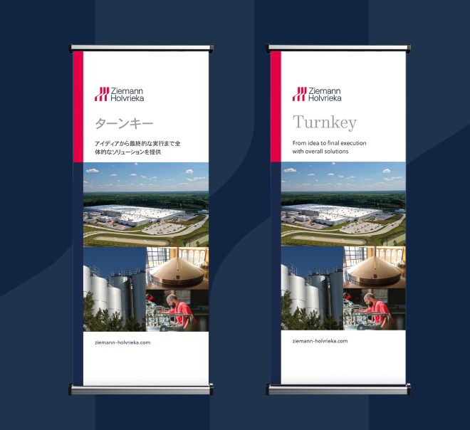
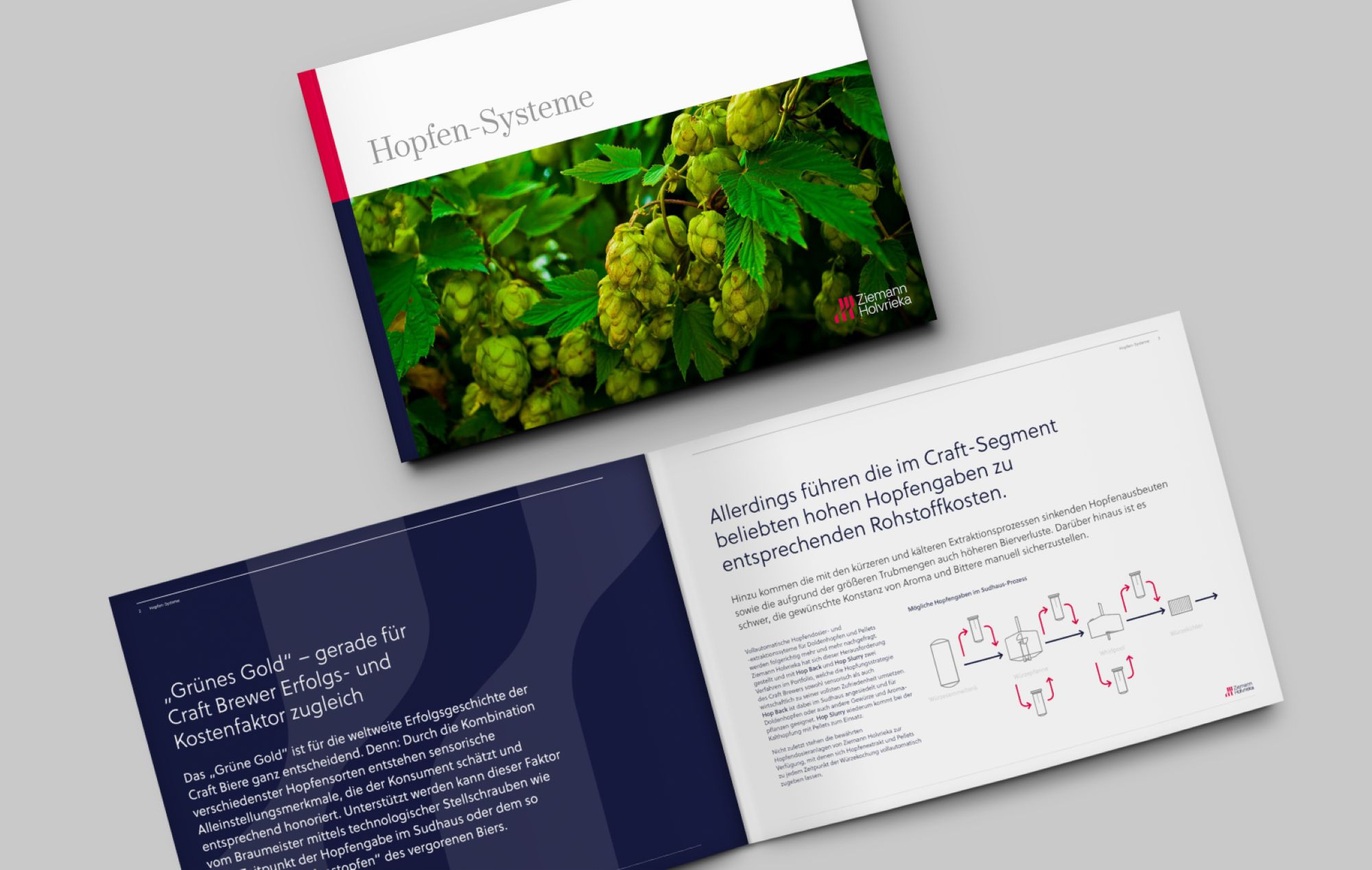
Complete rebrand | Logo design + brand identity | Comprehensive brand guidelines | Responsive website | Exhibition design | Marketing materials | Social media design | Brochures + sales collateral
Ziemann Holvrieka required a fresh, new identity that reflected their significant heritage but with a strong focus on the future.
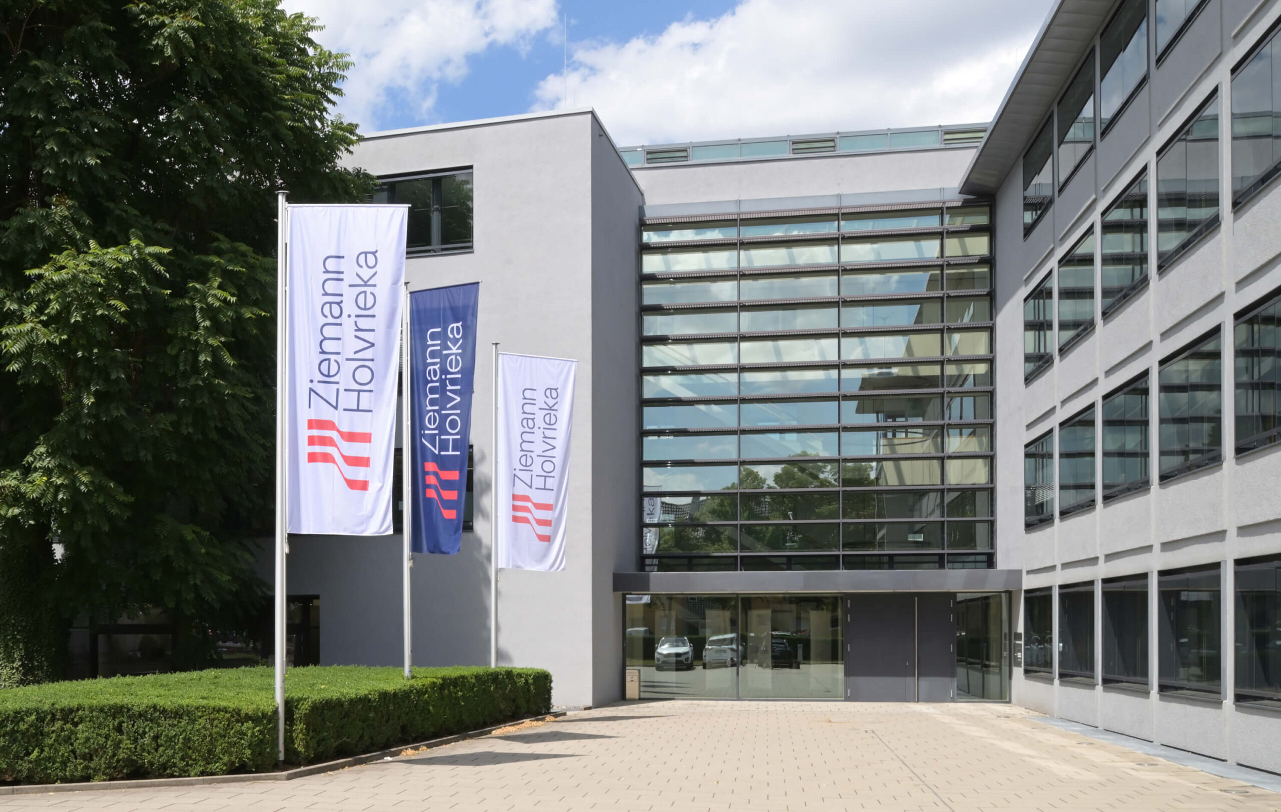
This corporate identity was a joy to work on. We worked closely with the leadership team to completely re-imagine their logo, as they put their trust in us to create a striking new look. This developed into a comprehensive brand system, that covered all channels. They embraced the new design and ensured that every touchpoint was updated, ensuring no matter where they are operating in the world, they are instantly recognisable.


“Beverage brand Ziemann Holvrieka’s outdated brand was not allowing it to reach its audiences effectively. It worked with CRUSH to create an identity inspired by the shape of the tanks and vessels produced by the company. The new look is sleek, professional and confident, allowing Ziemann Holvrieka to communicate its industry expertise and ambitious future aspirations.”
From Transform Awards Europe
“Ziemann Holvrieka, a leading company in the beverage industry with over 170 years of experience, has achieved an impressive transformation through its rebranding. The new brand identity seamlessly combines tradition and future by emphasizing both technological excellence and sustainability. Particularly noteworthy is the flexible visual system, enabling consistent and impactful communication across countries and languages. With its clear aesthetics and strategic depth, this project sets new standards for contemporary and global brand management.”
From German Brand Awards
From our client
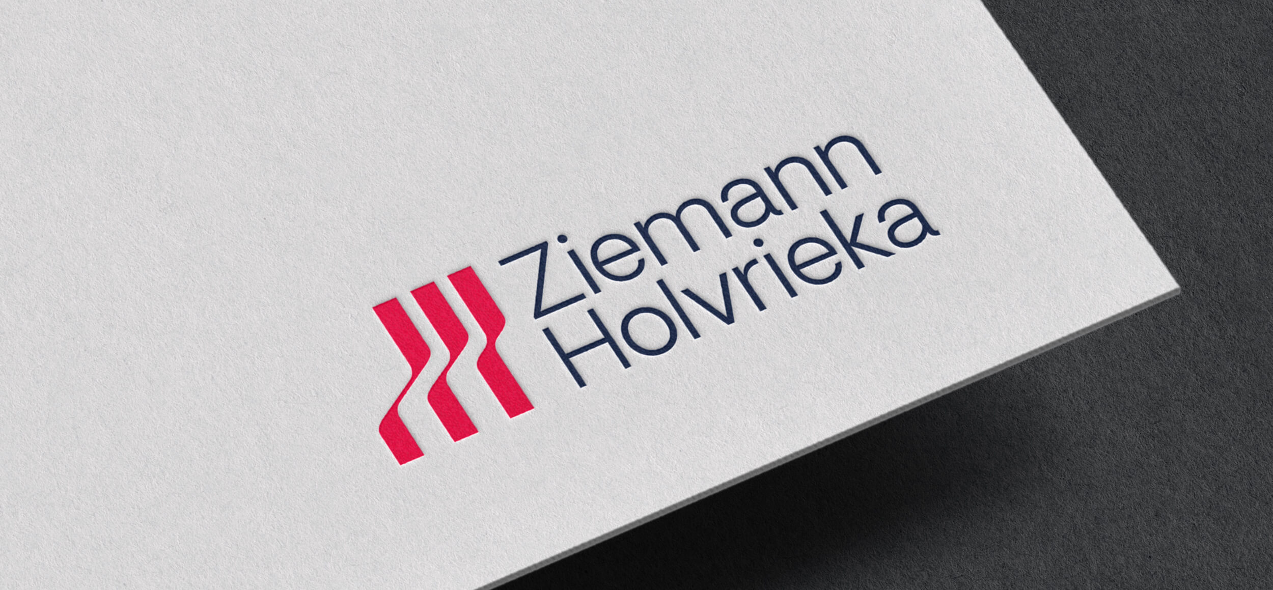
“We wanted to present our long, shared tradition even more strongly and visibly as a unit, but also our orientation towards the future. The logo combines a striking emblem, a new icon and fresh colours. The symbol reflects the shapes of Ziemann Holvrieka’s tanks and vessels and points upwards as an expression of high technology, change and dynamism.”