Brand Identity
Kate approached Crush having a good idea of what she was looking for in her brand identity, including a preferred colour scheme. But what she needed was it all bringing to life, and exploring typography and a flexible colour palette, along with an overall design style.
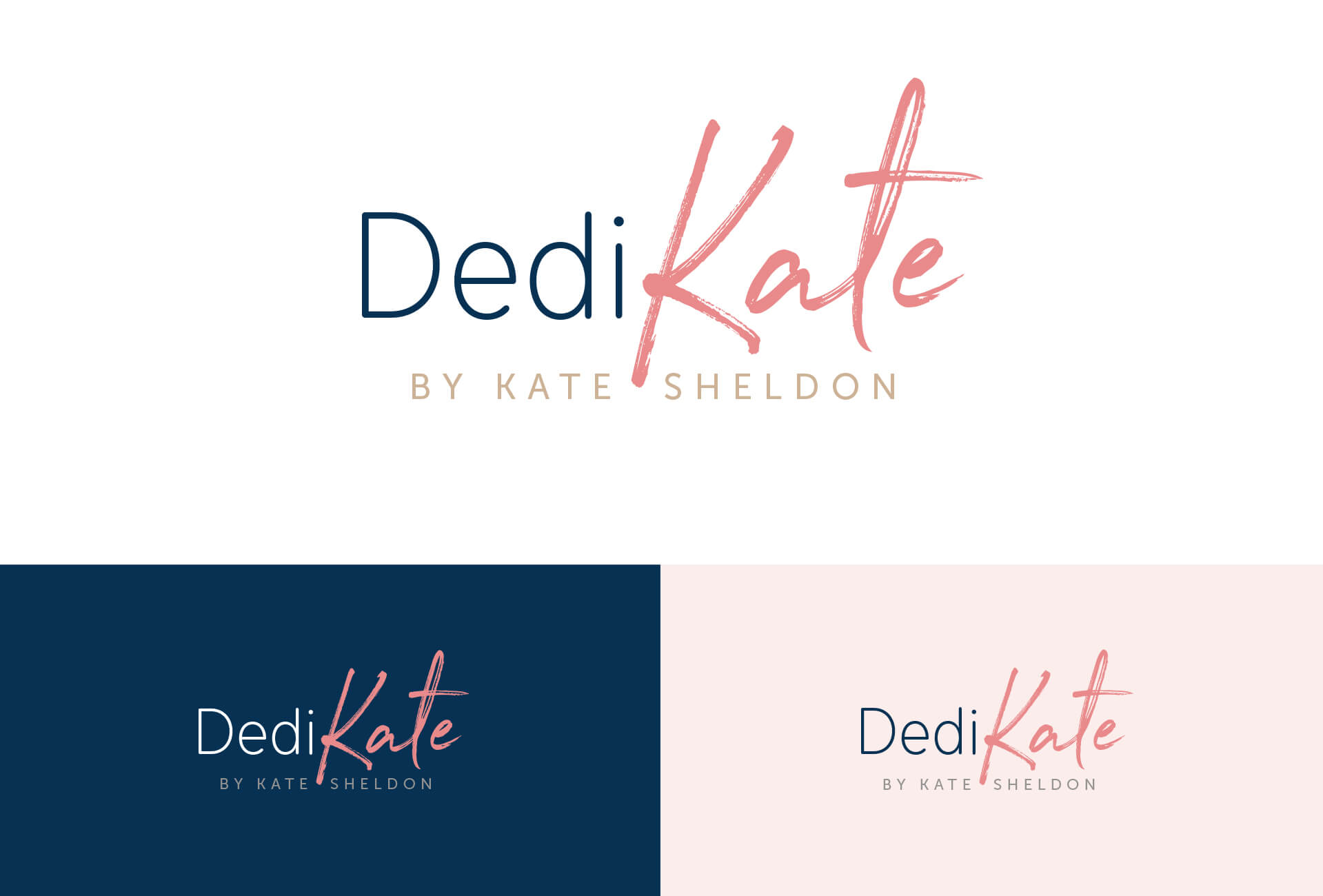
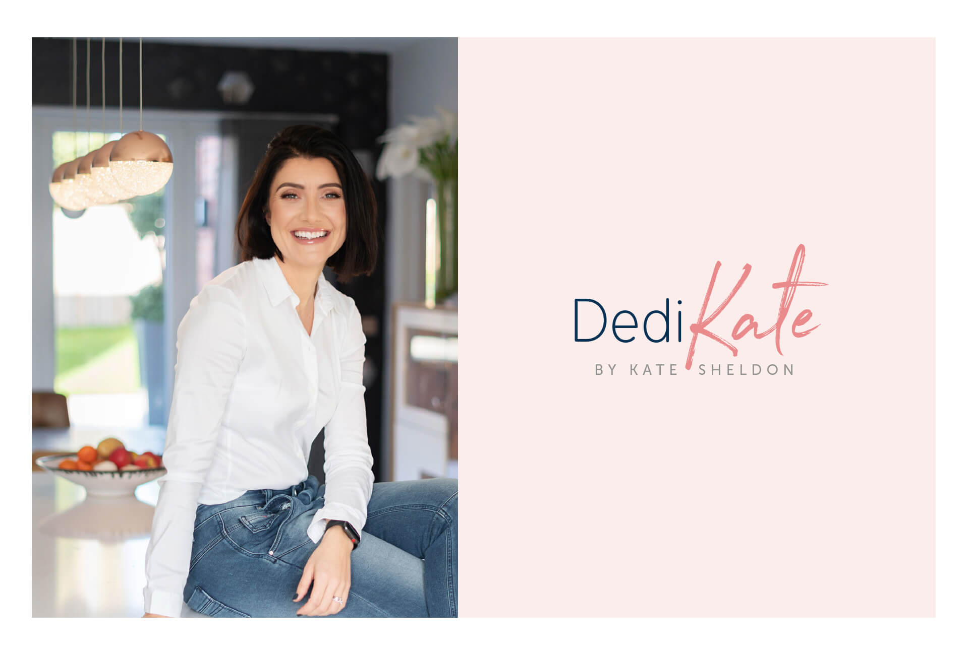
The logo we created combined the business title with her own. This ensured Kate’s name remained memorable within the personal fitness and nutrition sector.
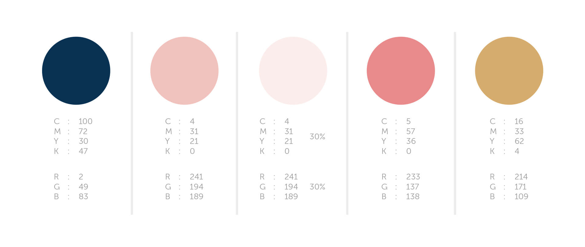
This gorgeous palette mixes feminine tones with a contrasting blue and gold for highlights.
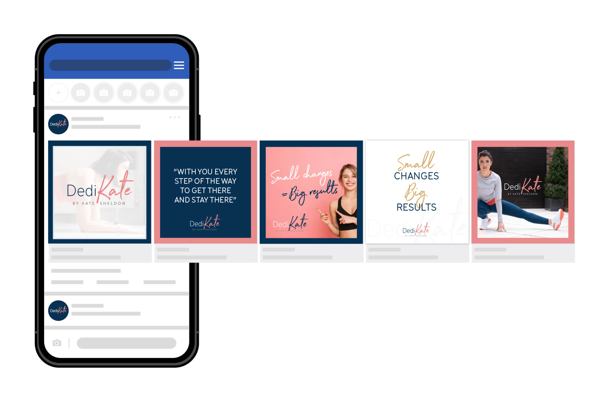
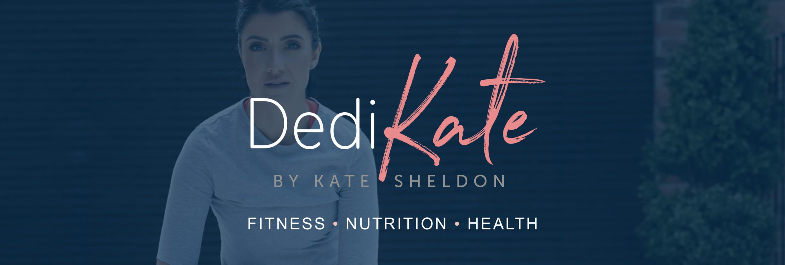
The paler tones of the palette were chosen to compliment Kate’s business photography. The darker tones of palette are used to great effect for social media, offering flexibility for styling a variety of post types.