
An Operating Brand turns your brand into a working commercial system.
Most brand projects hand over a guidelines document and stop, whereas an Operating Brand carries through into the proposals and pitch decks your team builds every week.
What you get
Built for the real world.
Every Operating Brand produces the same three things, though the weight of each varies with the brief.
Brand strategy
The strategy work opens with an audit of where the business sits today and how it reads against the companies you compete with. It closes with a positioning statement and a clear account of why the business exists.
Between those two points we write the tone of voice, build the messaging hierarchy that sales and marketing both work from, and set out who your audiences are and what each of them needs to hear first. Where a business carries sub-brands or sits inside a group, brand architecture is part of the work.
Visual identity
You get a full logo suite with the rules for using it, a typography and colour system, and art direction covering iconography, illustration and photography, so that everything produced afterwards looks as though it came from the same place.
Underneath all of it sit layout principles and a grid, which is the part that makes the system usable by people who were not in the room when it was designed.
Sales and
marketing toolkit
This is the part your team uses every week. Digital brand guidelines they can find and follow, templates for sales presentations, proposals and quotes, a capability brochure, a stationery and email signature suite, and social templates with the profile assets to match. All of it is built to be picked up and used without coming back to us each time.
Optional add-ons
Most Operating Brands projects grow beyond the core. Websites are the most common addition and we design and build them in house. Beyond that, exhibition and event design, employer brand materials, motion and film work, and ongoing content and campaigns are all things we can take on once the system exists, and each of them is faster and cheaper because it does.
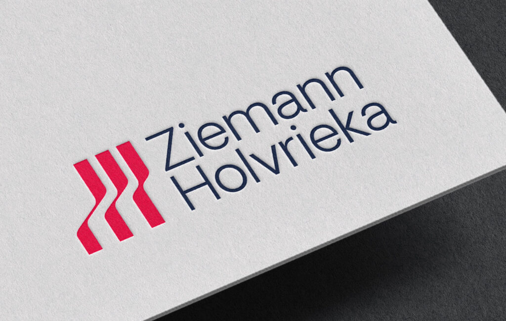
Ziemann Holvrieka
Engineering | Manufacturing | B2B
Rebrand | Visual Identity | Website Development | Marketing Materials

We wanted to present our long, shared tradition even more strongly and visibly as a unit, but also our orientation towards the future. The logo combines a striking emblem, a new icon and fresh colours. The symbol reflects the shapes of Ziemann Holvrieka’s tanks and vessels and points upwards as an expression of high technology, change and dynamism.
Florian Schneider, Managing Director, Ziemann Holvrieka
Read more